How many Authors does the Prime Minister have for his speeches: A Stylometric Analysis
Some time back, an audio clip was broadcasted on a Pakistani television programme, purportedly of the Prime Minister of Pakistan, Nawaz Sharif, and his aides, who were discussing what to write in an important speech. The clip generated debate for few days, with some raising more questions on how speeches are written by the various Political leaders in Pakistan — is it the case that normally such speeches are written by an individual, whereas special events compel leaders to commission speeches or to write them in collaboration with their aides?
Arguably, traditional forms of investigation into such questions will be laborious and protracted. In contrast, however, can we use Computational means to accelerate our inquiries?
It turns out that we can view such tasks as Authorship Attribution problems, and leverage Stylometry to identify if shifts in Stylistic patterns are observed across various speeches, using Computational tools. In fact, Stylometry has been used to assess authorship in historic texts, as well as recently in identifying J.K. Rowling as the most probable writer of The Cuckoo’s Calling.
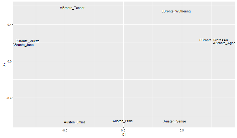
As an example, nine English novels from the 19th Century can be analysed and grouped based on the Stylistic patterns exhibited by each author. The following graph shows 3 novels from Austen (Emma, Pride and Prejudice, Sense and Sensibility), Anne Bronte (Agnes Grey, The Tenant of Wildfell Hall), Charlotte Bronte (Jane Eyre, The Professor, Villete), and Emily Bronte (Wuthering Heights) analysed for Stylistic similarities, using the stylo package in R.
The analysis above, albeit incomplete and simplistic (it is based simply on the 50 most frequent words by each author), is able to capture similarity in style for Jane Austen, grouping her novels together. Because it is a simplistic analysis, it groups together Charlotte and Ann Bronte’s novels (these have traditionally been difficult to differentiate). Techniques have been proposed, however, which are more robust and sophisticated (such as the Consensus Bootstrap Network, explained in the following sections).
The crucial assumption in Stylometry is this: There exist habits for each person, formed unconsciously, in regards to words’ and Language usage. These determine the structure, diversity, and word choice in each person’s writings, forming a Stylistic signature. Whilst the writer is conscious of the ideas she writes about, Stylistic variations go unnoticed. Any deviations from such often indicates a change of authors.
For this post, I will attempt to analyse the speeches of the Prime Minister Nawaz Sharif, to see if any Stylistic deviations can be highlighted.
Basic Analyses
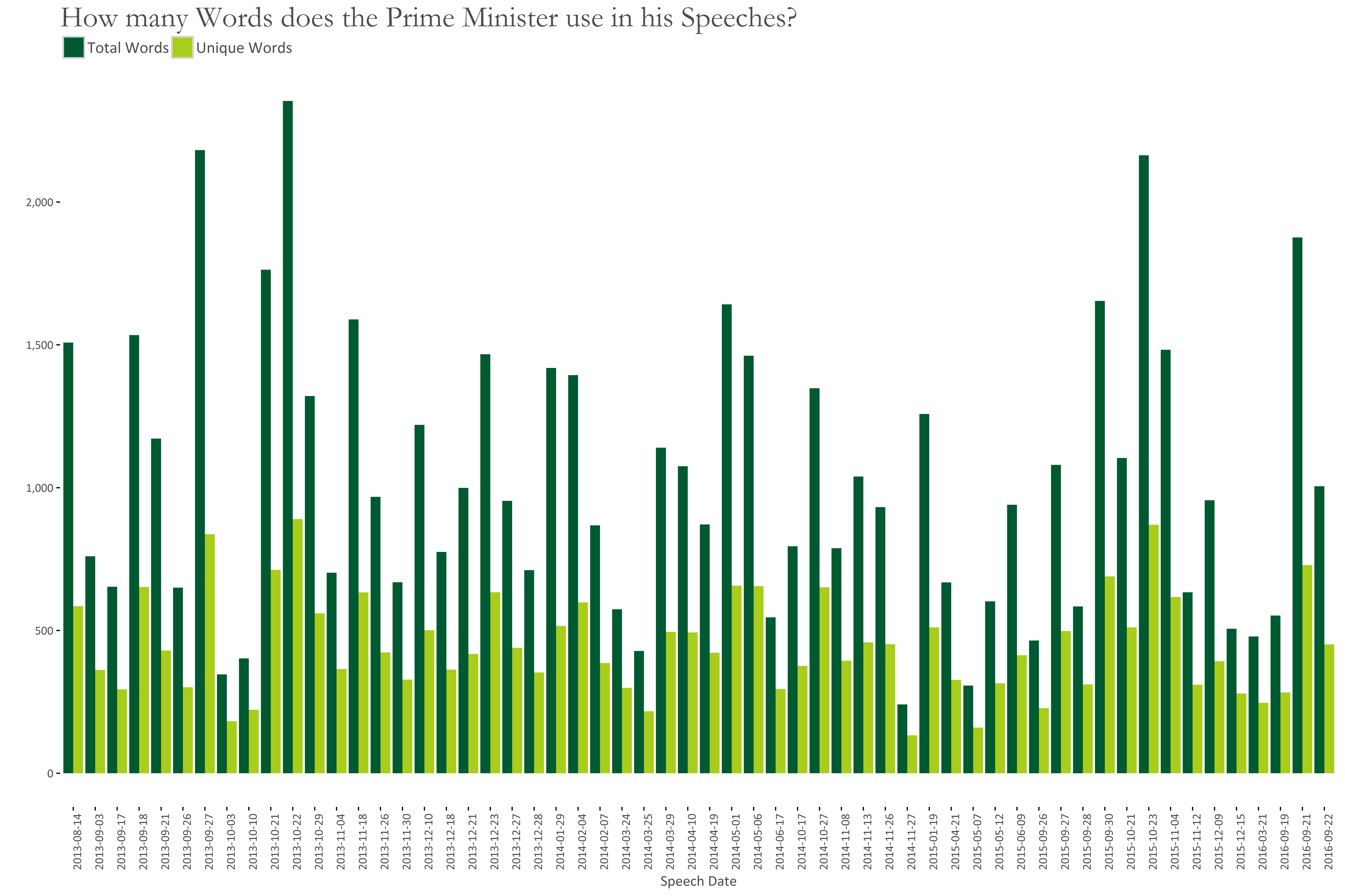
This section covers highlevel views of our data. The following graph shows the total number of words, and total number of unique words in each speech. Speeches are arranged chronoligically on the x-axis.
We see that some speeches comprise of 500 or less words. These can often fail Stylistic analyses due to insufficient data found in them. I will try to remedy this, however, by analysing some features of the data that are found to be less sensitive to data size.
We see that longest speeches were done at:
- 27th Sep. 2013 (General Debate of the 68th Session of the UN General Assembly),
- 22nd Oct. 2013 (PM’s Address at US Institute of Peace),
- 23rd Oct. 2015 (PM’s statement at the US Institute of Peace)
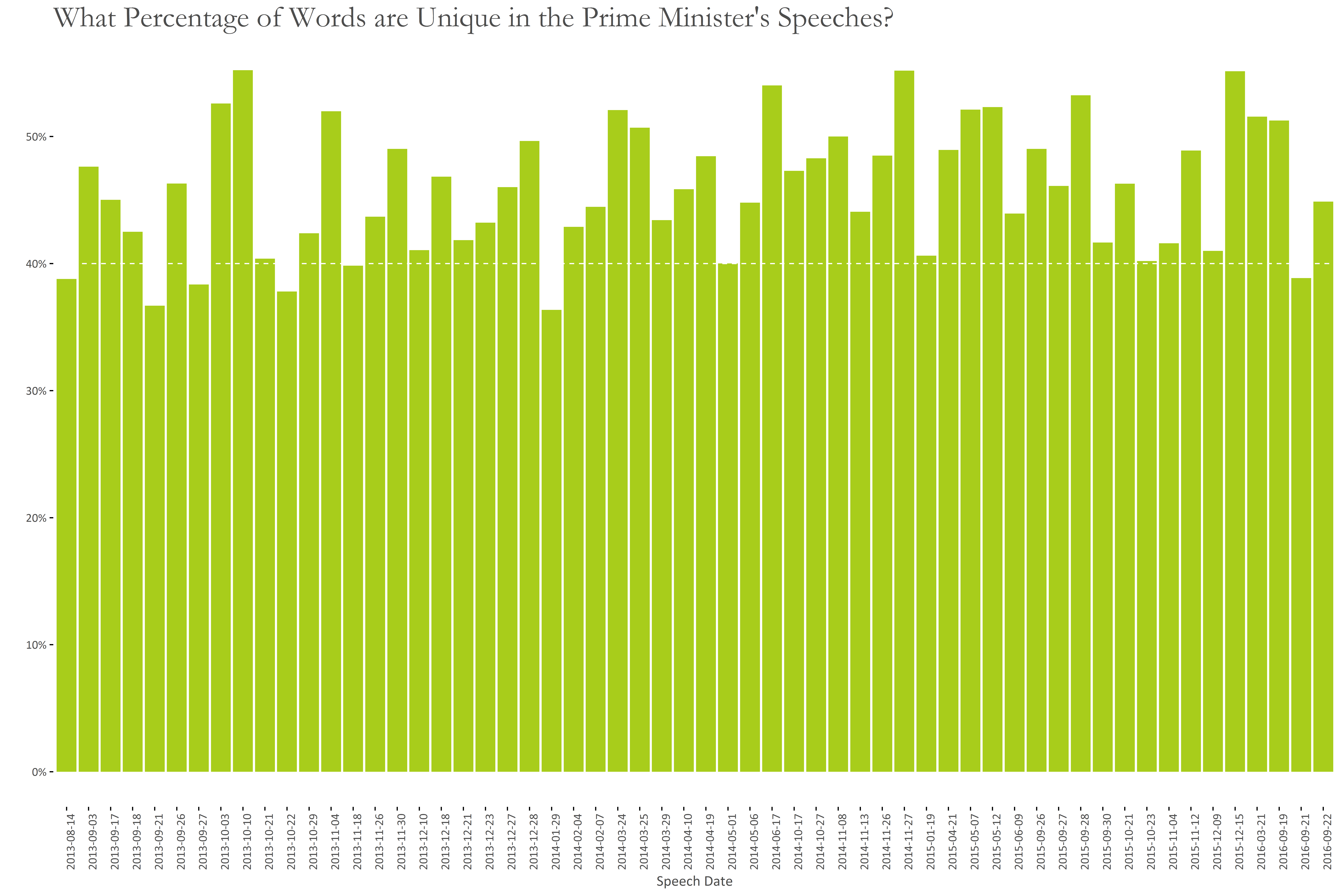
The graph below shows percentage of unique words in each speech. Generally, 40-50% of the words are unique in the PM’s speeches.
Peaks occur at:
- 3rd Oct. 2013 (Remarks of the PM on the commissioning/inauguration of Latif Gas Field development)
- 10th Oct. 2013 (Address by the PM on the graduation parade of 130 GD(p), 75 Engineering, 89 Air Defence Courses…)
- 27th Nov. 2014 (PM’s Speech on the 18th SAARC Summit at Kathmandu)
- 15th Dec. 2015 (Statement of the PM at the SCO Heads of Government Meeting)
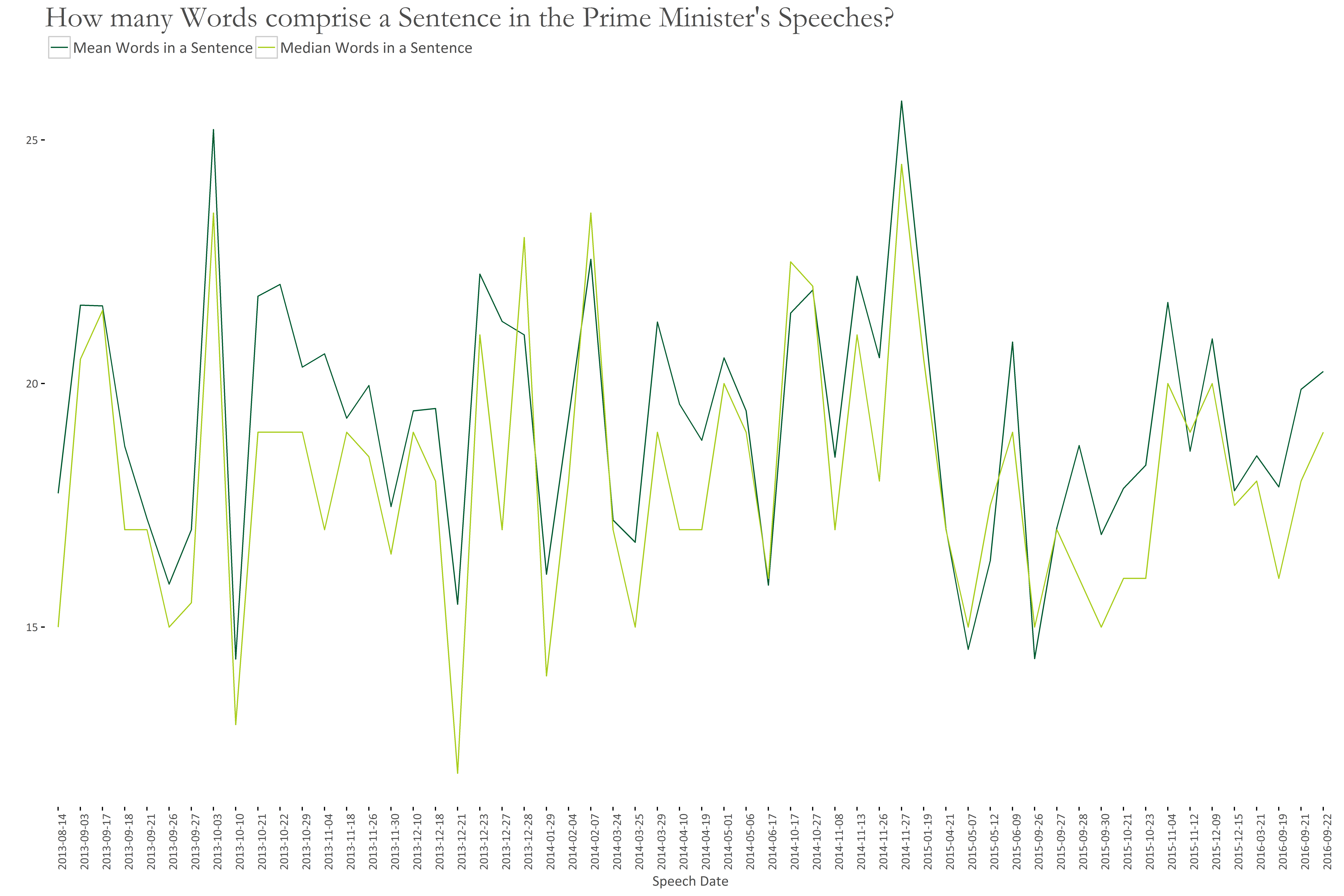
The following graph shows the average length of sentences, in terms of number of words.
Here, the sentences with highest number of words are for these speeches:
- 3rd Oct. 2013 (Remarks of the PM on the commissioning/inauguration of Latif Gas Field development)
- 27th Nov. 2014 (PM’s Speech on the 18th SAARC Summit at Kathmandu)
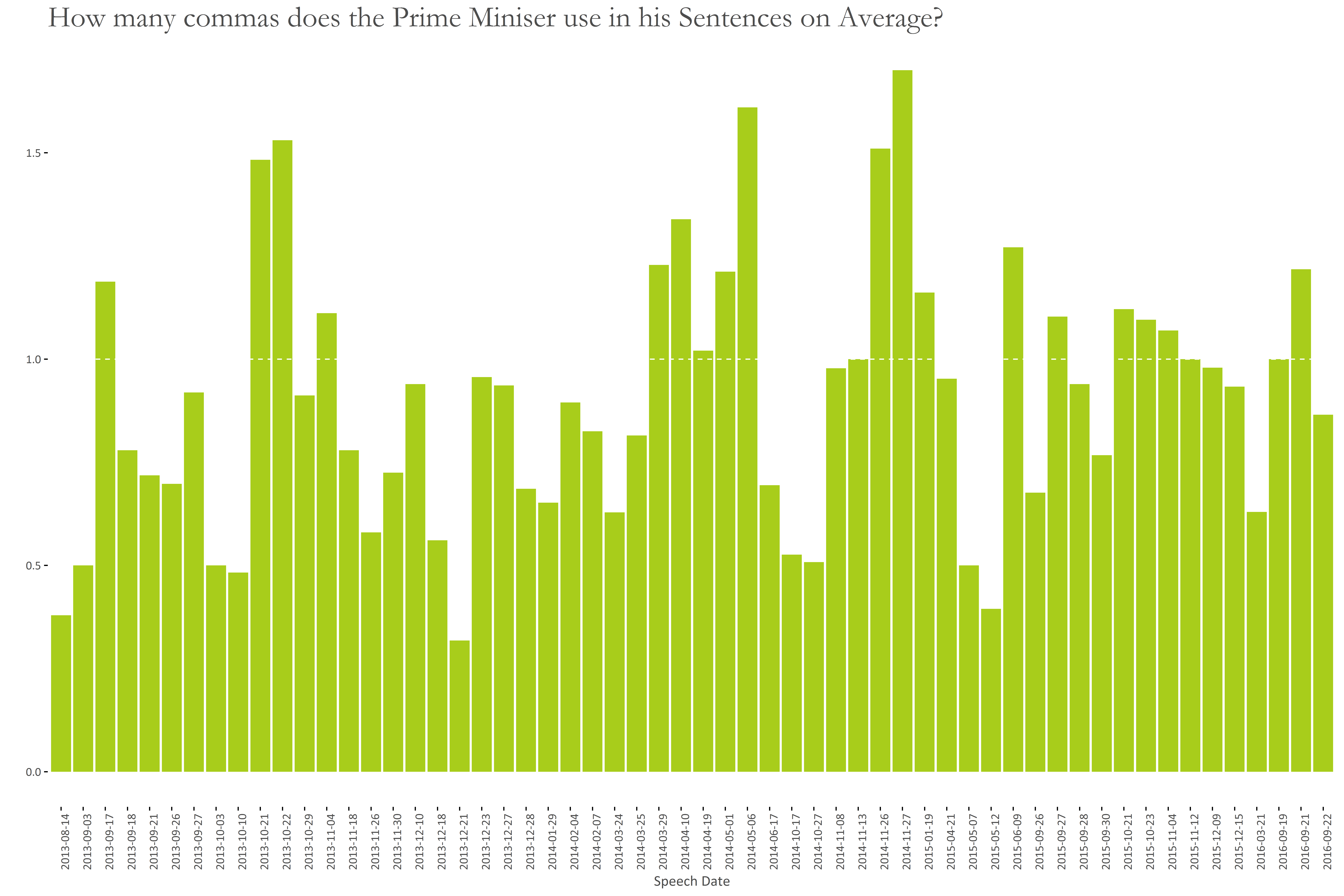
In the following graph, the average number of commas in a sentence are shown for each speech.
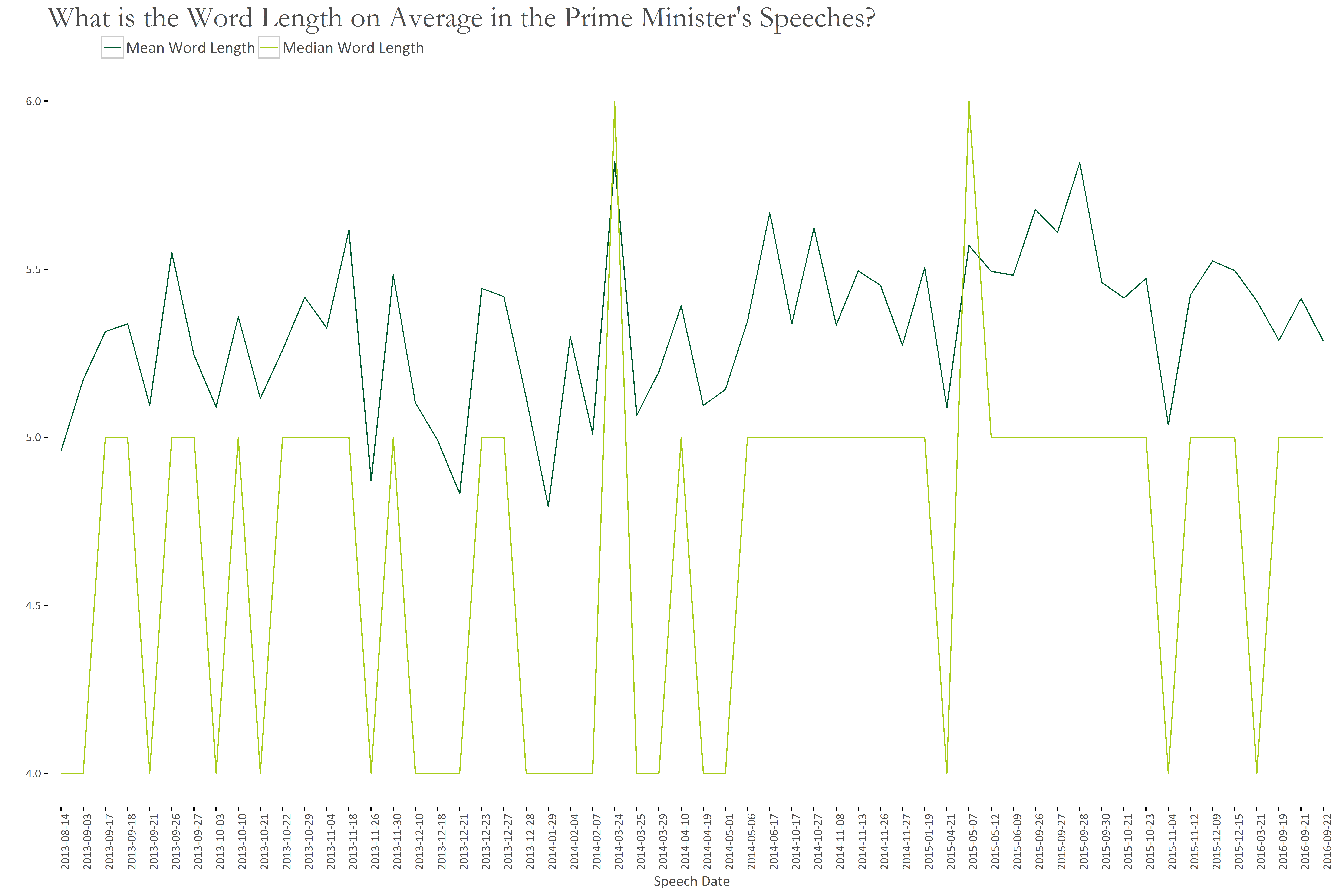
The graph below shows that on average, the length of a word in the PM’s speech is around 5. Some peaks, however, are for:
- 24th May 2014 (Statement by PM at the Nuclear Security Summit at The Hague)
- 7th May 2015 (Remarks by the PM Pakistan and President Maldives at Joint press stakeout)
- 28th Sep. 2015 (Statement by PM as co-host at the UN Peacekeeping Summit)
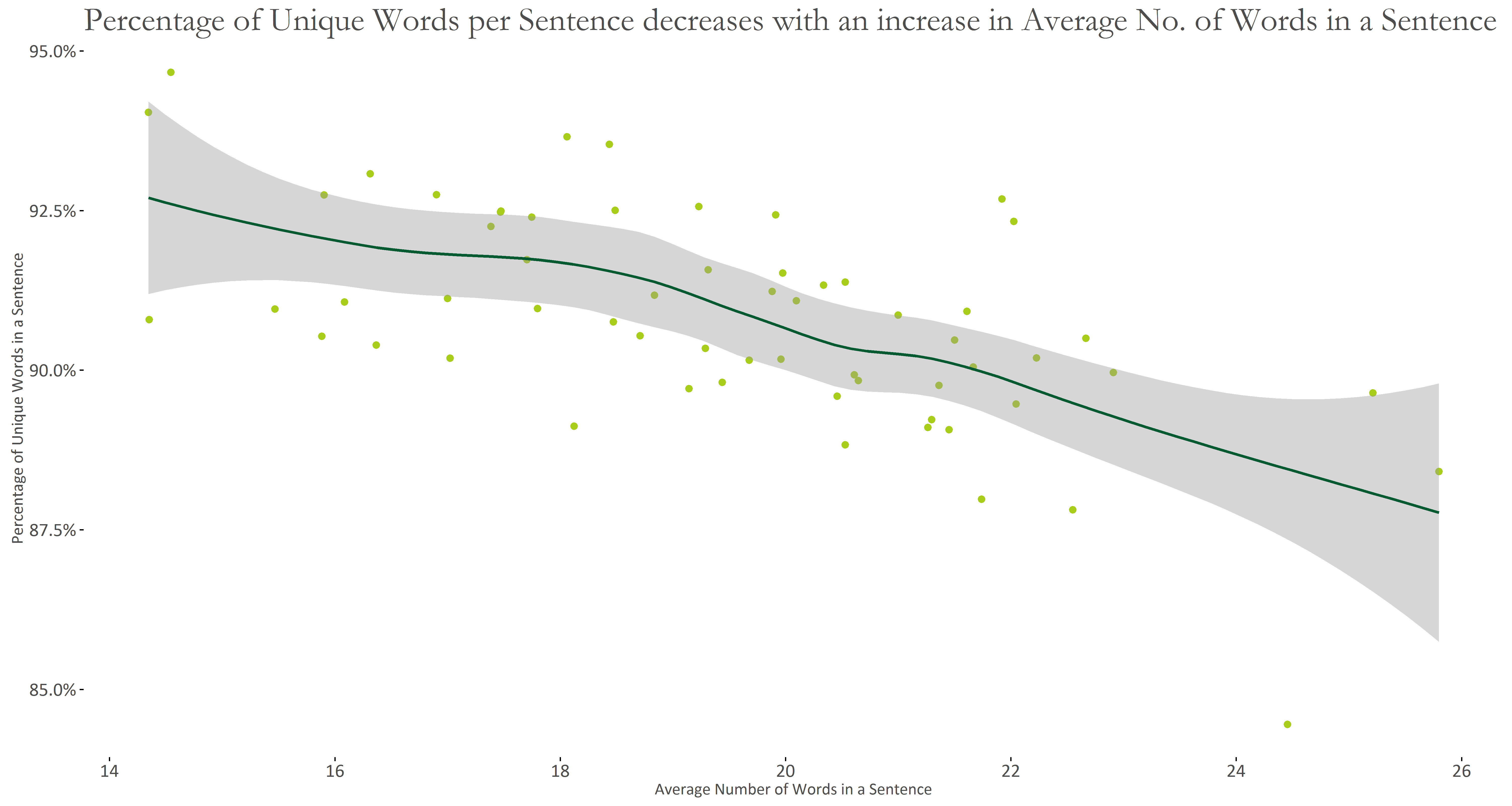
Naturally, as the number of words in a sentence increase, the number of unique words decreases:
Authorial Analysis
To find patterns and deviations therefrom, we need to generate features that are able to capture these. In Authorship Attribution, features typically found most useful are:
- Most Frequent Function words
- Most Frequent Bigram words
For my analysis, I used the following sets of features:
- Basic Statistics calculated at Speech and Sentence level
a. Avg. No. of words in a sentence
b. Avg. No. of characters in a sentence
c. Avg. No. of commas in a sentence
d. Avg. No. of colons and semi-colons in a sentence
e. Type-Token Ratio per sentence
f. Avg. Length of words in a speech
g. No. of Punctuation marks by Total characters in a speech - Most Frequent Function Words
- Most Frequent Bigram Function Words
- Most Frequent Bigram POS Tags
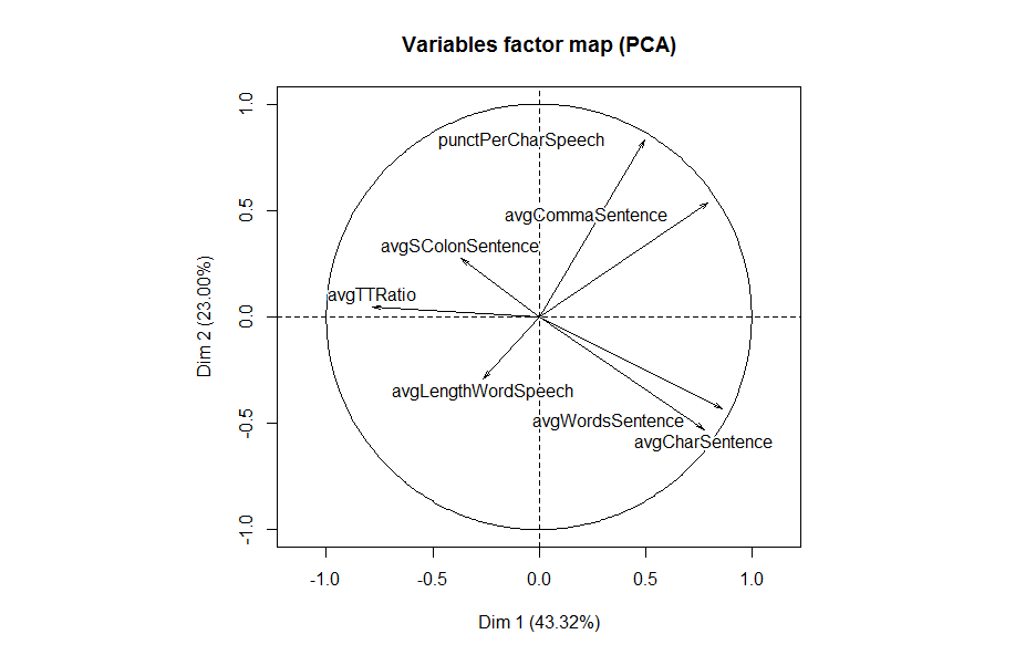
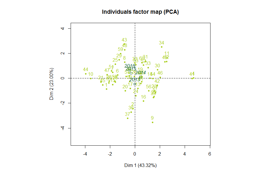
I did not rely on 1. for a Stylistic analysis, since the other features have been demonstrated to perform better. The following PCA graph, however, presented some interesting patterns.
We see that the avgTTRatio (Average Type Token Ratio per Sentence) is negatively correlated to avgWordsSentence (Average Words per Sentence), and avgLengthWordSpeech (Average Length of Word in a Speech) is negatively correlated to avgCommaSentence (Average Comma per Sentence). This means that as the sentence is prolonged, it becomes less lexically diverse. It also shows that as longer words are used in a speech, the number of commas used in a sentence are decreased.
Using the FactoMineR package in R, we can supplement this with the year a speech was given, to see if any patterns can be deciphered. In the following, each year is mapped onto the graph to represent a typical speech for the respective year.
It seems the PM’s speeches have evolved over time: We see that the typical speech for 2013 is placed below the x-axis. Recalling from the previous graph, 2013 speeches, then, seem to consist of lengthier sentence and words. The typical speech for 2014 is placed on the positive side of x-axis — these appear to be characterised by an increase in comma usage. For 2015 and 2016, the typical speech is placed above and at the negative side of the x-axis. These appear to contain more unique words per sentence, as well as an increase in (semi)colon usage.
Such features of data, however, have not been found effective in capturing Stylistic variations. Hence, instead of using these features I will rely on Frequent Function words and POS tags.
Most Frequent Bigram POS Tags
Syntactic labels from a partial parsing of text documents has been evaluated to be promising in regards to Authorial analyses. For my task, I obtained the POS tags of the PM’s speeches, using the openNLP package in R.
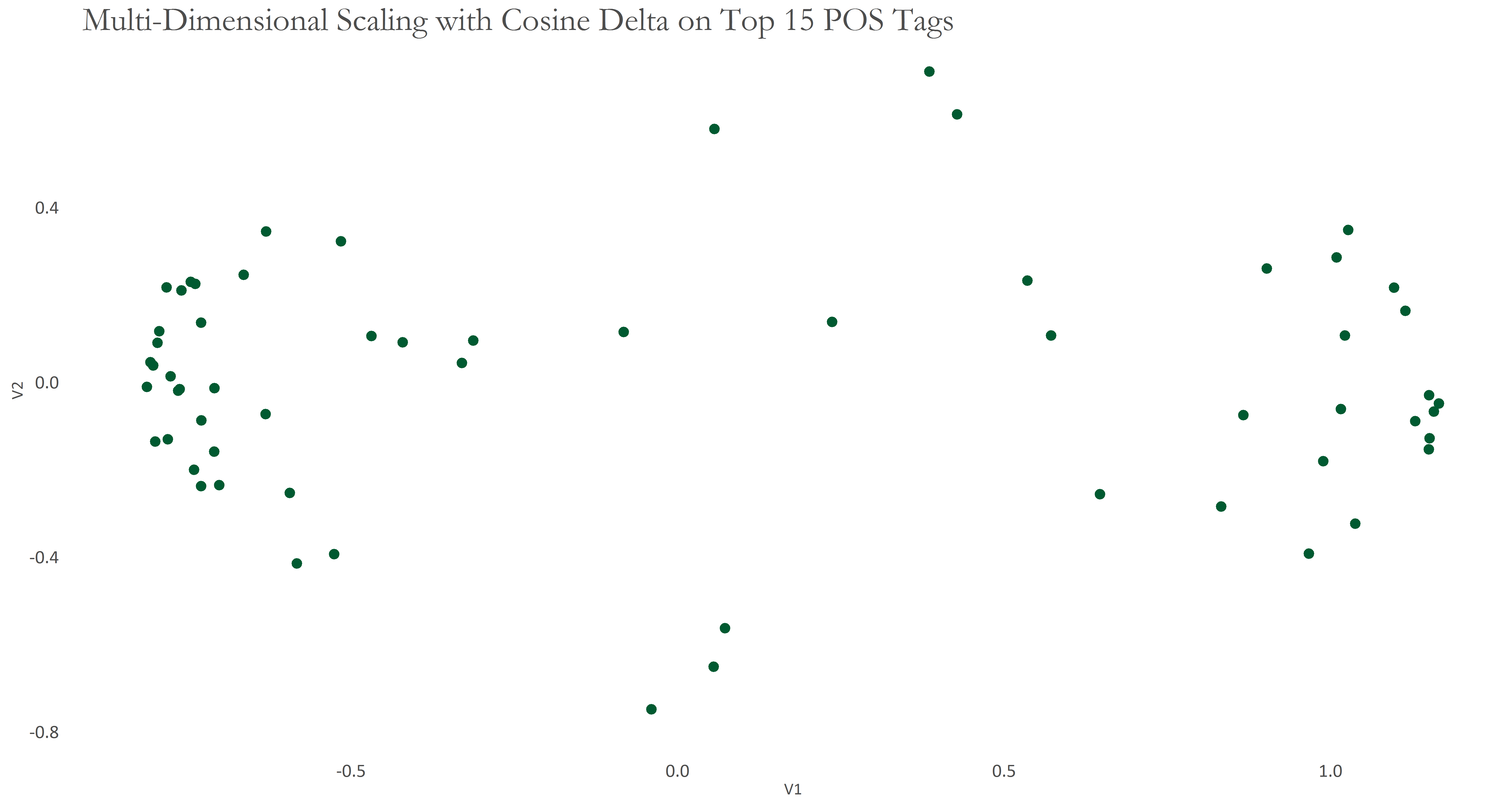
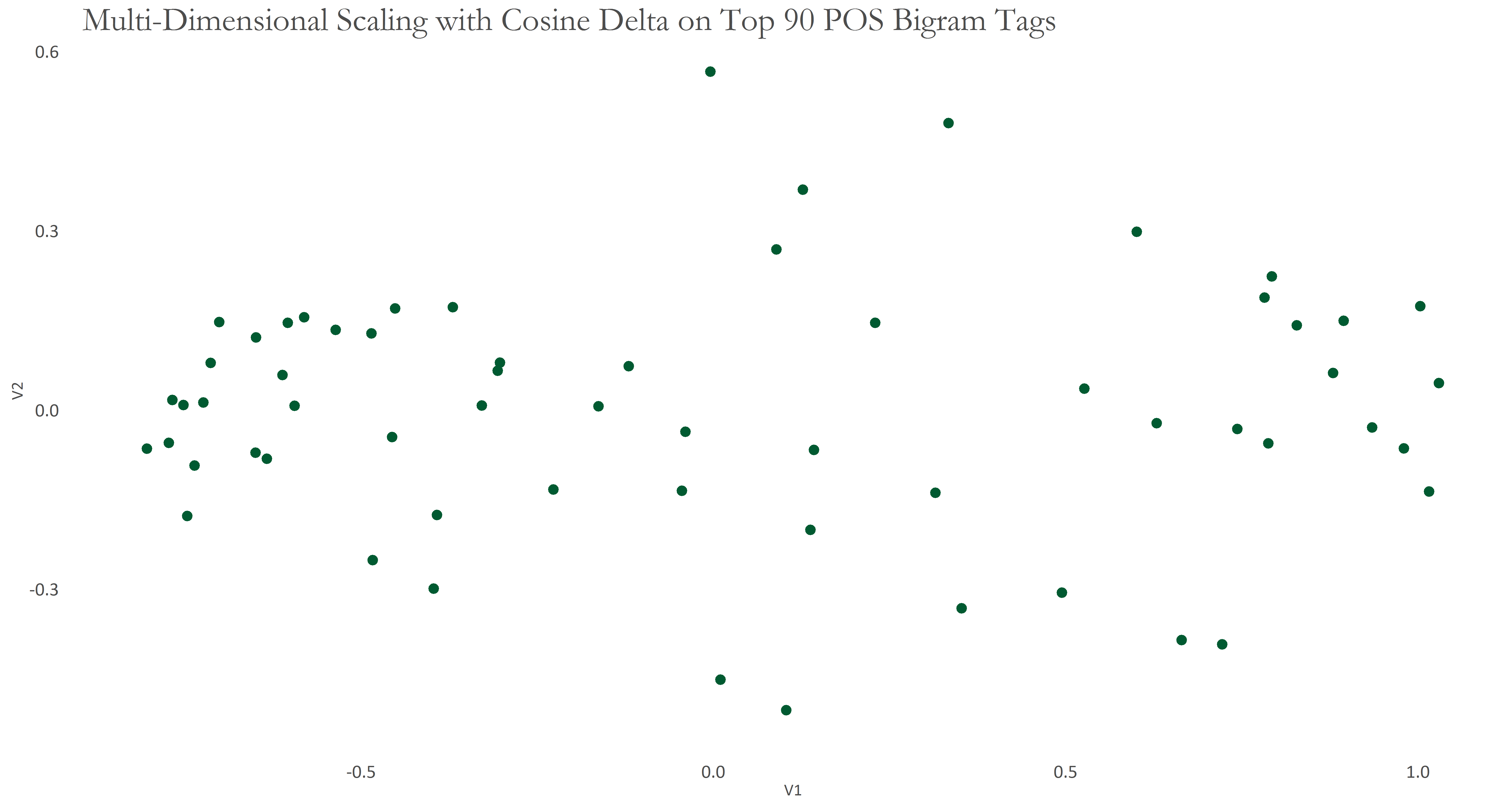
Initially, I selected the 15 most frequent POS tags, where most frequent is defined by the frequency of occurrence. Then, I selected the 90 most frequent POS bigrams, where most frequent was calculated by frequency of occurrence, as well as the occurrence of a bigram in at least 50% of the speeches. The resulting graphs are shown below, respectively.
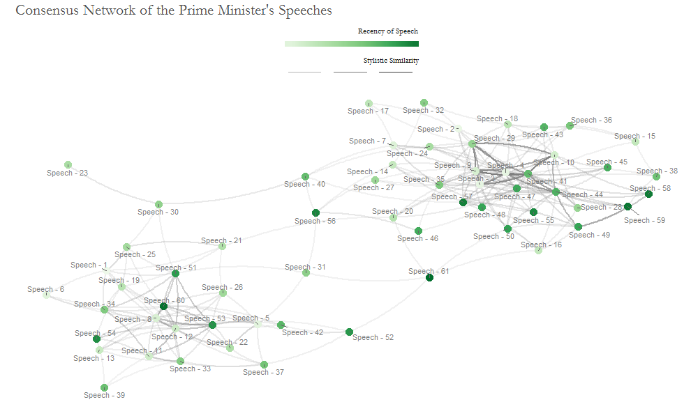
The graphs appear to show two separated clusters of speeches. This analysis can be simplistic, so I use Bootstrap Consensus Networks to add more rigour - an idea which is due to Maciej Eder, who is also one of the writers of the fantastic stylo package in R. The following graph shows such a network, built on 30, 60, 90, 120, 150 Most Frequent POS bigrams. Once these 5 batches of data were generated, I obtained the most similar 5 documents from each batch. Then, for each document I filtered out any similar documents that were not present in at least 3 batches. Thereafter, I calculated the average distance for each document between the resulting set of most similar documents. Please note that this configuration is slightly different to that of Eder’s.
This again appears to show 2 separated clusters of documents. I attempted to cluster these speeches using the Random Walk Community Detection method, which is used to find dense subgraphs (the modularity was 0.455). Four groups of speeches were identified in this way, which can be found here.
Best to explore further using most frequent word unigrams and bigrams.
Most Frequent Function Words Unigrams
The set of most frequent function words was obtained in the following manner:
- Selecting the Top 20 words in terms of frequency using the entire collection of speeches
- Selecting words that are present in at least 50% of the speeches
- Combining the sets of words achieved from 1. and 2.
- Curating a list of non-function words from the speeches which will be removed from our set of most frequent words
This resulted in 53 Most Frequent Unigram Words, after carefully removing those that were deemed to be non function. Admittedly, this is a short list of words to delineate Stylistic patterns, but my hope is that since these occur in most speeches and have been carefully formulated, they may still be successful.
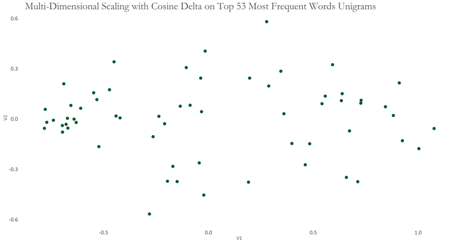
For the following graph, I applied the Cosine Delta to our dataset of function words and used Multi-Dimensional Scaling to see if any patterns can be observed when a high-dimensional dataset is compressed to show the same information in 2 dimensions. The graph appears to show two clusters which seem to be weakly linked by some speeches (represented by points) in between.
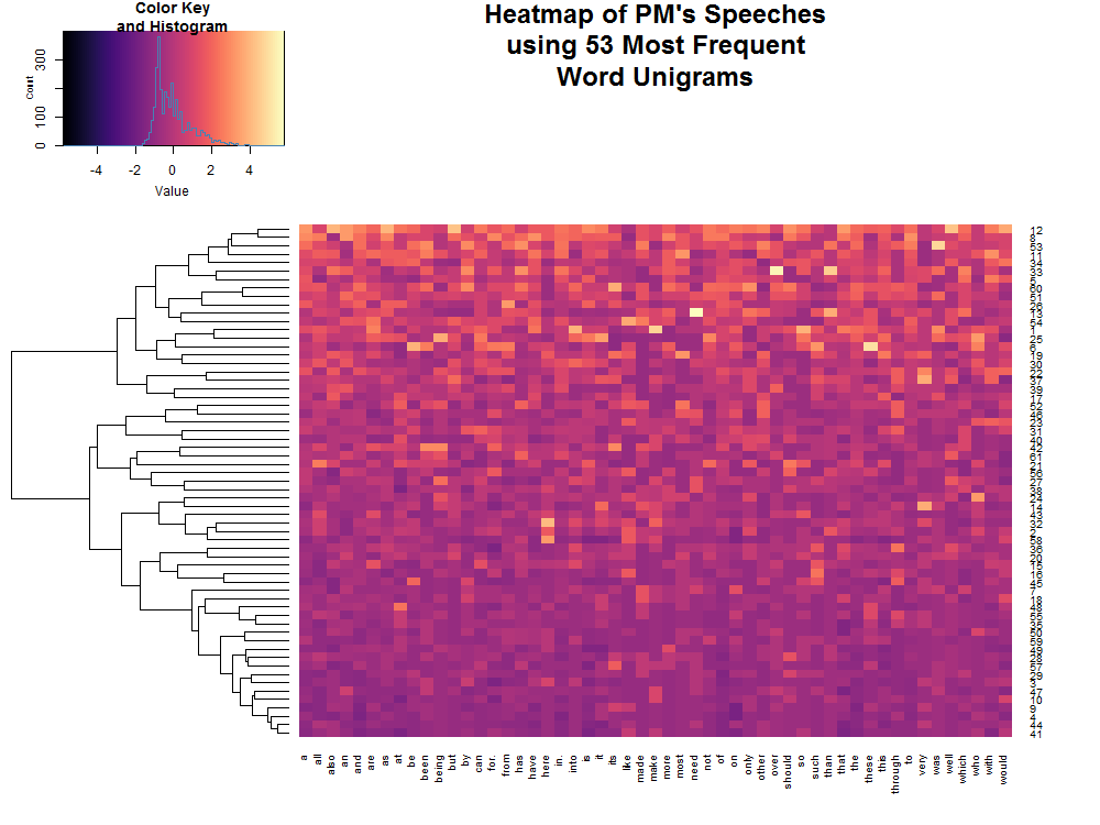
Since our feature set is already minimal, building a consensus network may not be appropriate. Instead, we can visualise the data with a Heatmap with a Clustering Dendrogram. The following graph shows two clusters using the branches at the very top of the dendrogram, which appear to split speeches that have high and low values for the feature set we formulated.
Another way to assist understanding of the data is to cluster the speeches into groups of similar speeches, whilst also identifying which speech is typical (in terms of the unigrams used in our analysis) for each group — Partitioning Around Medoids. This technique was applied with bootstrapping to attempt to produce better results, using the fpc package. Two clusters/groups were identified again, as shown here, with the exemplary speech for each emboldened.
Most Frequent Function Words Bigrams
Since these may not be sufficient to conclude any findings, we need to look at bigrams too. Again, a set of most frequent function bigrams were produced in this manner:
- Selecting the Top 30 bigrams in terms of frequency using the entire collection of speeches
- Selecting bigrams that are present in at least 40% of the speeches
- Combining the set of bigrams achieved from 1. and 2.
- Curating a list of non-function bigrams from the speeches which will be removed
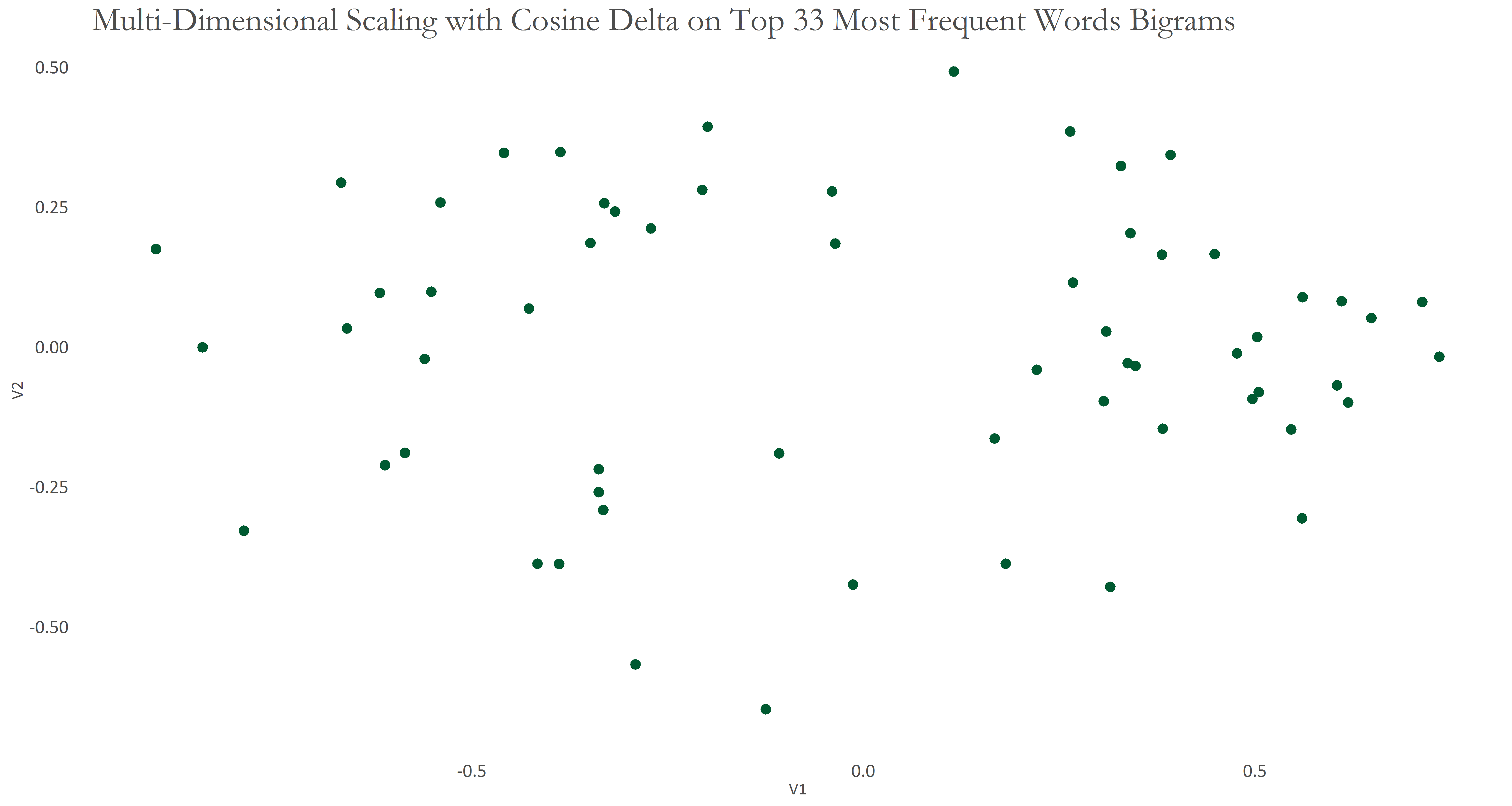
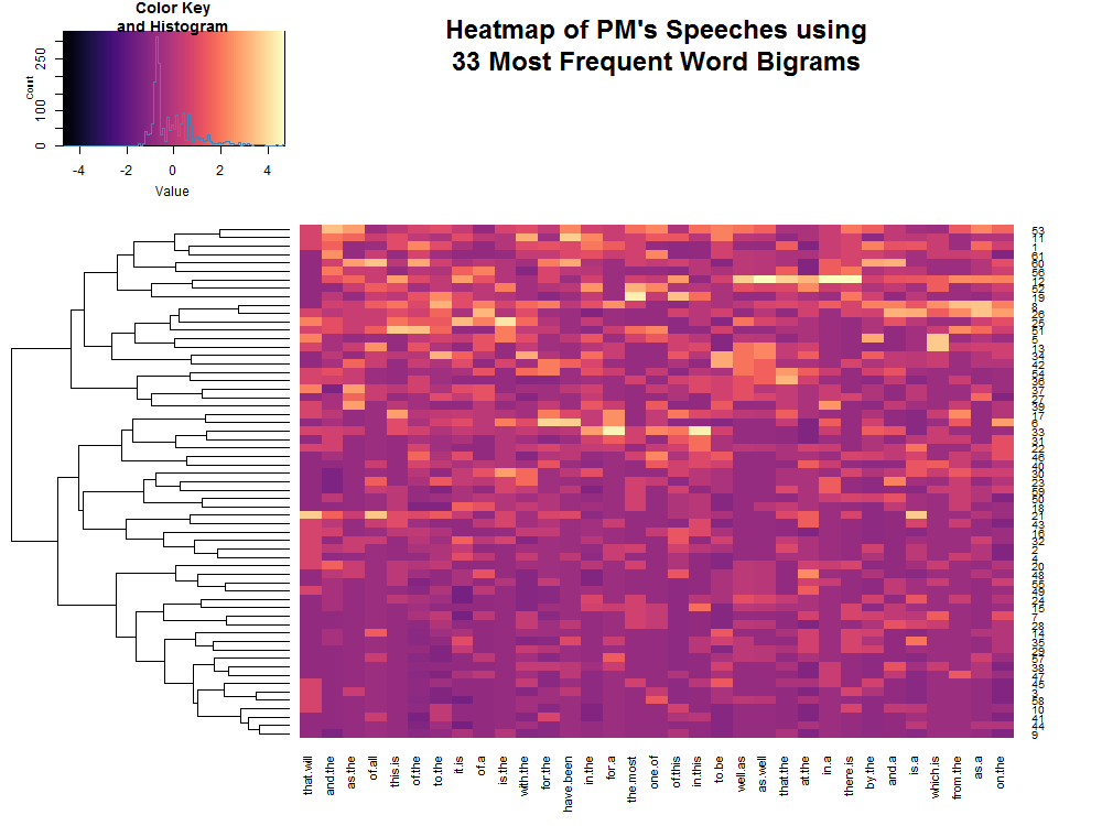
This produced 33 Most Frequent Bigram Words, which is even shorter than our list of unigram words. The consolation, however, is that these appear in at least 40% of all speeches. I applied the Cosine Delta on these data and visualised the following using Multi-Dimensional Scaling. The resulting graph again seems to show 2-3 clusters of points, with the group on the right being denser. To see which features/variables were contributing to each cluster, I used a heatmap with hierarchical clustering.
To group these speeches based on similarity of each, I applied Partitioning Around Medoids with Bootstrapping, again. Groups obtained are shown here, with the most representative speech from each group boldened.
Most Frequent Character 4-grams
Given that feature set comprised of words (unigram and bigrams) was very low, I decided to attempt the same analysis using 4-gram characters from the speeches. The feature set using 4-gram characters was formed in this way:
- Selecting the Top 40 4-gram characters in terms of frequency using the entire collection of speeches
- Selecting bigrams that are present in at least 50% of the speeches
- Combining the set of bigrams achieved from 1. and 2.
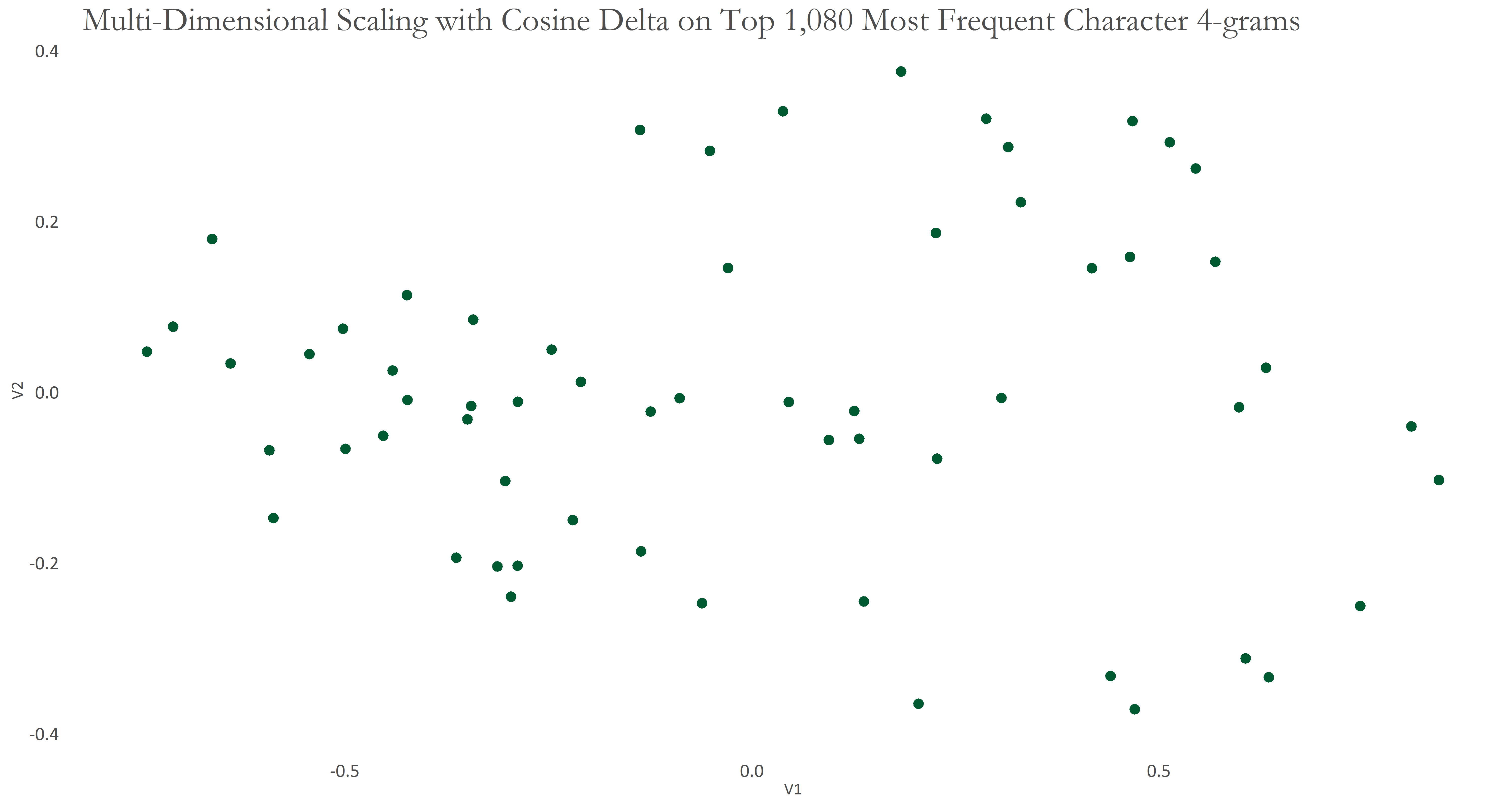
Using these 1,080 features consisting of 4-gram characters, I applied Cosine Delta on our data and visualised the result using Multi-Dimensional Scaling.
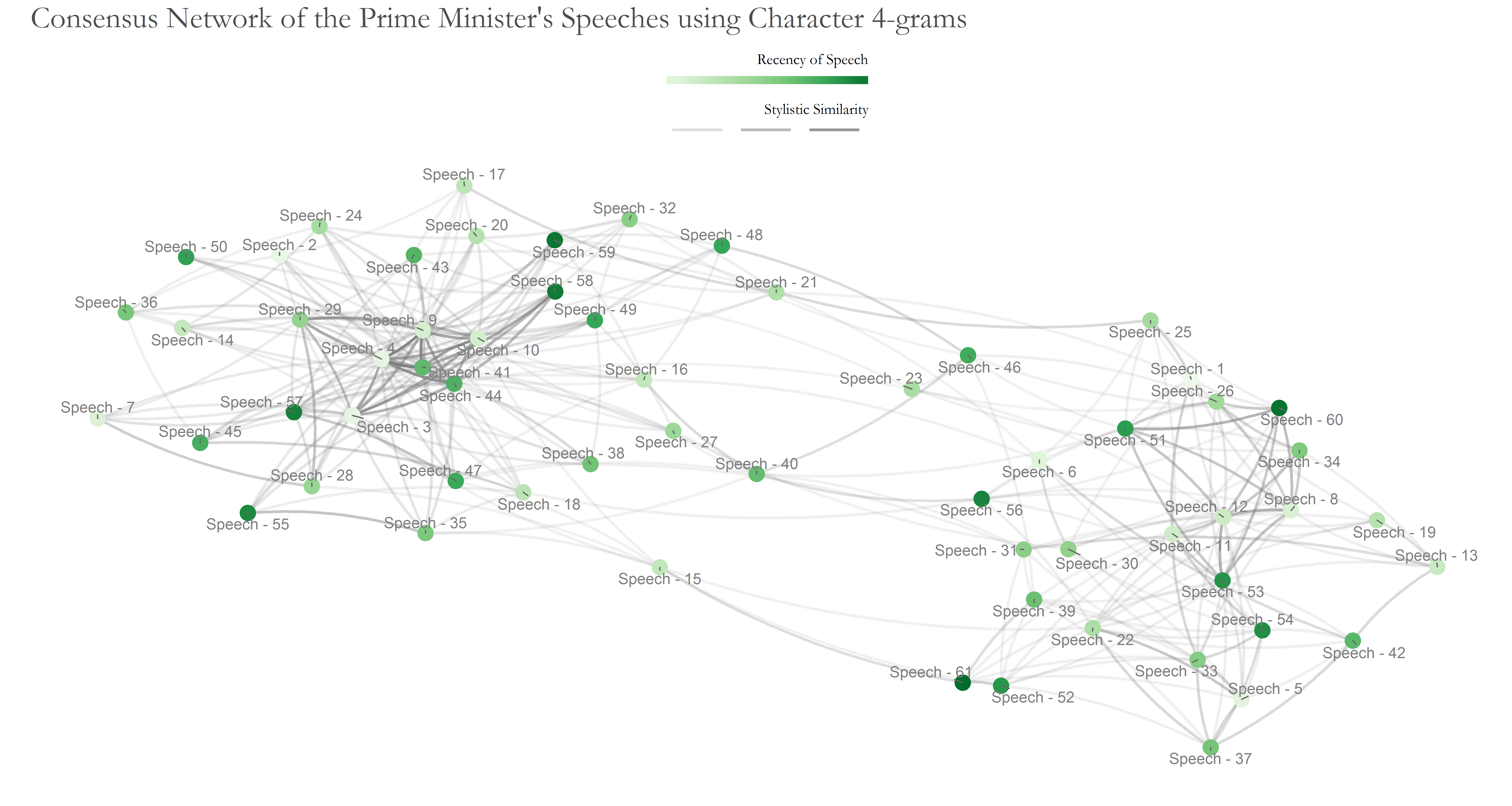
The resulting graph appears to show 3 groups of points/speeches. Since we have a large number of features, we can take advantage of a Bootstrap Consensus Tree. This is presented below; I used 90 features for the first data set, doubling them until all 1,080 features are used eventually. This formed 12 batches.
A reference to the speech codes is provided here.
In the graph above, we see two groups of densely connected speeches, with 4 speeches settled in between, linking the two otherwise distinct groups. I used the Random Walk Community Detection method again to find compact subgraphs. The modularity achieved was 0.44, with the subgraphs shown here:
Conclusion
There appear to be 2 groups in which all of the speeches of the Prime Minister can be collected into, based on the usage of words therein. But does this mean we have proven that there are 2 authors of the speeches?
Actually, our analyses suggest that there appear be more than one, under the assumption that each person carries her own style of writing, and that such have been captured in our data (proving is quite difficult in Stylometry, and even in the investigation of the Cuckoo’s Calling, it was not proven that J.K. Rowling is the actual author. Rather she was concluded to be most likely the author). It is noteworthy that some speeches of the PM are scarce (less then 500 words), and that we only have 61 speeches at our disposal. It may have been useful to analyse speeches from the previous tenure of the PM. These, however, were unavailable. So I will probably re-run these analyses again, once the PM’s tenure ends, as he would have given more speeches in the interim. It is entirely possible that with more data captured the shape and/or sizes of clusters change.
It is also noteworthy that this was an open-world Stylometric analysis — one in which we are unsure how many and which authors have produced a written work. And while this study shows or attempts to uncover Stylistic shifts, it does not attempt to indicate if somebody standing by the shoulder has been dictating the speeches!
Although the scope of this article was limited to English speeches, the methods of using Most Frequent Words and Bigrams do apply to Urdu too, since such techniques are language agnostic. Sadly, however, only a few Urdu speeches of the PM are available at his office’s website, and are stored as images rather than text. I wager we would have seen some interesting patterns therein.
The scope of this article also did not admit an analysis to find if any sentences or paragraphs likely to have been injected by another author — (dis)similarities of sentences against others within a speech would indicate this. This objective might be pursued in future.
For the time being, you may proceed to read the clustered speeches — Do they have a different ‘feel’?
One of the clusters is larger than the other. Does this indicate that, insofar as the clusters are valid and representative of two authors, that the Prime Minister favours one author more than the other (so to give more assignments to the former)?
Ultimately, I suppose only the Prime Minister would be able to confirm this…
The R script for the analyses in this post can be found here.
Acknowledgements
stylopackage: Principal initial reference for Stylometry- Mike Kestemont for kindly sparing time for discussions on Stylometry
FactoMineRpackage: Initial Cluster Analysesgplotspackage: For Heatmaps & Clusteringfpcpackage: For bootstrap ClusteringopenNLPpackage: For POS taggingigraphpackage: For Network Analysisggplot2package: For Visualisation
